How to Help Students Differentiate Between the Number 0 and Uppercase O
For all the ways that technology is changing the school experience for both teachers and students, an often overlooked one is legibility of student work.
Most teachers can appreciate how much easier it is to read students’ typed work as opposed to (some) students’ written work.
In a way, typing almost levels the playing field in allowing students to get their ideas on paper, without the need for perfect or even passable penmanship.
Sure, penmanship still matters, but as a teacher, I’d rather read a typed essay than a handwritten one any day.
That doesn’t mean, though, that typing is foolproof when it comes to confusing characters.
A common mix up?
Switching the number 0 and the uppercase O.
Sometimes even proficient typists will swap these two characters. These lookalikes can be particularly frustrating for students using Typing.com who are working on their accuracy.
So how can a teacher help students distinguish between these two characters?
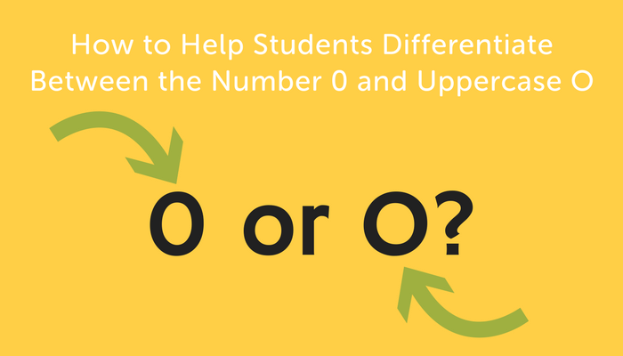
0 vs. O
There’s no denying that the differences between these two characters are subtle.
Your best bet in helping students know the difference during a typing lesson is to give them a chance to “preview” the characters they’ll be using in a given lesson.
As a teacher, it can be useful to log-in to a student account on Typing.com and project your screen.
With your class, you can preview any confusing characters that students might encounter in the day’s lesson.
In addition to 0 and O, this might include the number 1 and the letter l or even similar punctuation marks such as the colon (:) and the semicolon (;).
Let students take a minute to observe and share out the subtle differences between these characters.
When it comes to 0 and O, in most fonts, 0 is narrower and O is rounder.
I recently heard one teacher help students remember this by saying that 0 is skinnier because it has “zero fat”.
If students have a chance to think through these differences before they start a lesson when they aren’t stressed about WPM and accuracy, they’re more likely to internalize the subtle differences.
You can also remind students that in the real world most reading and typing on the computer happens in context, where it will usually be easy to figure out which character is intended.
As long as you’re being thoughtful about which key you want to hit, you shouldn’t have many problems.
And hey, it’s still easier than making sure your handwriting is perfect.